Statistical report
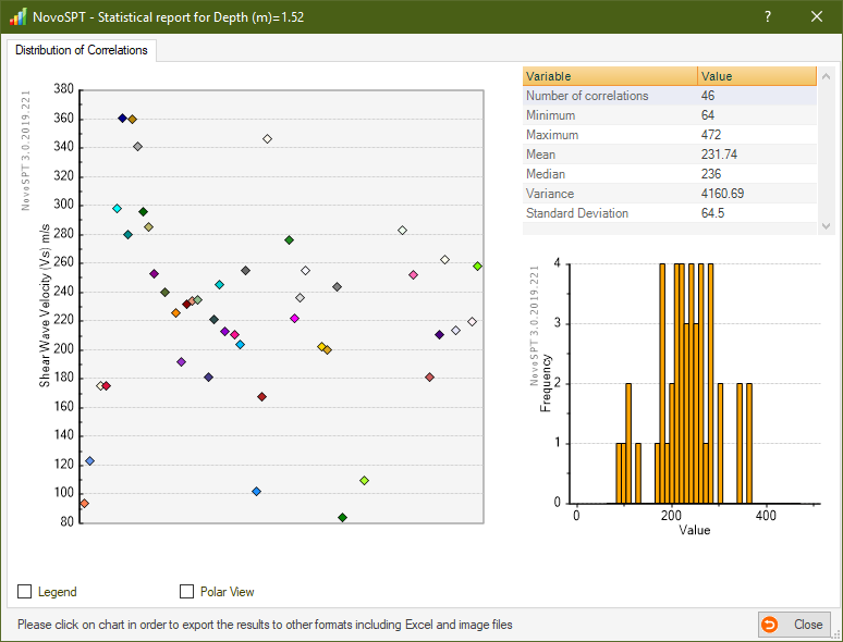
To better visualize the results of a specific soil property, a graph is presented on statistical chart. This graph shows scatter of the results for each soil parameter and helps user to compare those values and pick the most reasonable range for that parameter. Please notice that for those correlations that provide a range for the soil parameter, the value is shown as a vertical bar on the graph. To view additional information, move the mouse over each point on the graph to get more information about the correlation.
Click on each chart to open the chart in Chart Presentation Tool and you can export and print the data into other formats. |
