Charts Settings
All charts on top portion of the page, can be customized. There are four charts which are reserved for showing the soil parameters and one chart (on right part of the page) shows the Soil Behavior Type indexes. You may change the colors, line styles, chart type and more for each chart. The simplest way is to right-click on the chart and use the popup menu. The following screenshot illustrates the menu items:
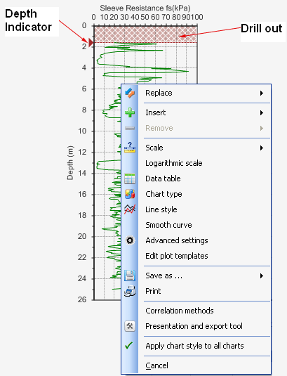
Replace: use this menu to plot a different parameter on the chart. In this case the current parameter(s) shown on the chart will be removed and replaced with the selected parameter.
Insert: used to overlay another parameter on the existing plots. For example, if the chart is currently showing σv (total overburden stress) and you want to compare σ'v (effective overburden stress) with σv, simply click on Insert from the menu and choose S'v (for a complete list of symbols and terms used in NovoCPT, please see this article).
Remove: used to remove a parameters from the chart when there is more than one parameter shown in the chart.
Scale: used to change the scale of horizontal and vertical axis of the chart.
Logarithmic scale: this changes the logarithmic scale of horizontal axis of the chart. For example, for hydraulic conductivity or OCR you may prefer to use logarithmic scale.
Data Table: shows the X,Y series used for plotting this chart.
Chart Type: a variety of different chart types including bar, column, XY scatter, line, Gannt, etc are available and you can change the chart type for presentation purpose. We recommend using XY Scatter or most of the charts.
Line Style: allows you to change the line style of the curve.
Smooth Curve: allows you to toggle between smooth (Bezier method) or line curve.
Advanced settings: shows the chart settings dialog, which enables you to change most of the above-mentioned properties in one dialog.
Edit plot templates: you can change the default settings used for plotting each parameter. This included style, color, chart type, captions, etc.
Save as ...: used to save the chart in image formats such as JPG, BMP, PNG, etc.
Print: this directly prints the chart.
Correlation methods: opens the Options page to change the CPT correlation methods used for interpretations of data.
Presentation and export tool: this is a very useful feature and shows the chart in another page, so that you can resize the page and the chart, see the data table besides the chart, change its settings, print, save as Excel and more.
Cancel: closes this popup menu.