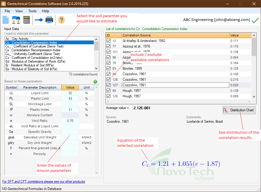
Once you are done with data entry, review the list of correlations (see screenshot below). By clicking on each row, additional comments and the actual equation are presented below the table. Based on these comments you may want to remove some of the results from the list by un-checking the box to the left of each row (for example the equation might have been derived for another soil type or geographical location, etc).

Once you remove an equation from the list, the "Average value" of the correlations will be updated.
How to export the table into Microsoft Excel
Click on the  File⏵Export menu. Then choose the file name and path in the dialog and the table/chart will be saved as an Excel file. File⏵Export menu. Then choose the file name and path in the dialog and the table/chart will be saved as an Excel file.
Visualization of correlated values
To better visualize the results of correlations, click on Distribution Chart button. A new page will show a scatter chart for the results which helps user comparing the correlated values and picking the most reasonable range for the soil parameter. In order to view additional information, move the mouse over each point on the graph.
|