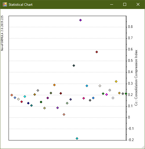
Distribution Chart
A distribution chart, summarizes all correlated values obtained from several available equations on the same chart. This allows user to get a reasonable understanding of distribution of results. For example, as it can be seen on this screenshot, the Cc values generally vary between 0.1 for 0.2 for the specific input data provided to the program.
In order to get the source (name of geoscientist) of each point, simply move the mouse over the point. |
